THE PRESIDENTS CUP
One of the most unique scoring situations Ive encountered, the famed Presidents Cup proved to be a welcome exercise in data organization. This is the first event I would work within the confines of the match point system, not only did I have to learn this system, but in turn make it easily understandable to first time fans.

We accomplished this by defaulting all tournament branding to a straight white, while the only color used would belong to the teams. Red and Blue for the United States and Black and Yellow for the International team. Winning scores would be highlighted in the respective team colors or a color takeover of single row would indicate a team lead or win. This became the basis of our match graphics and would become the leading inspiration for the LIV Golf package.
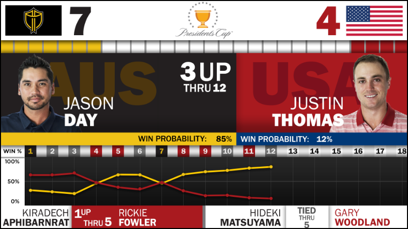
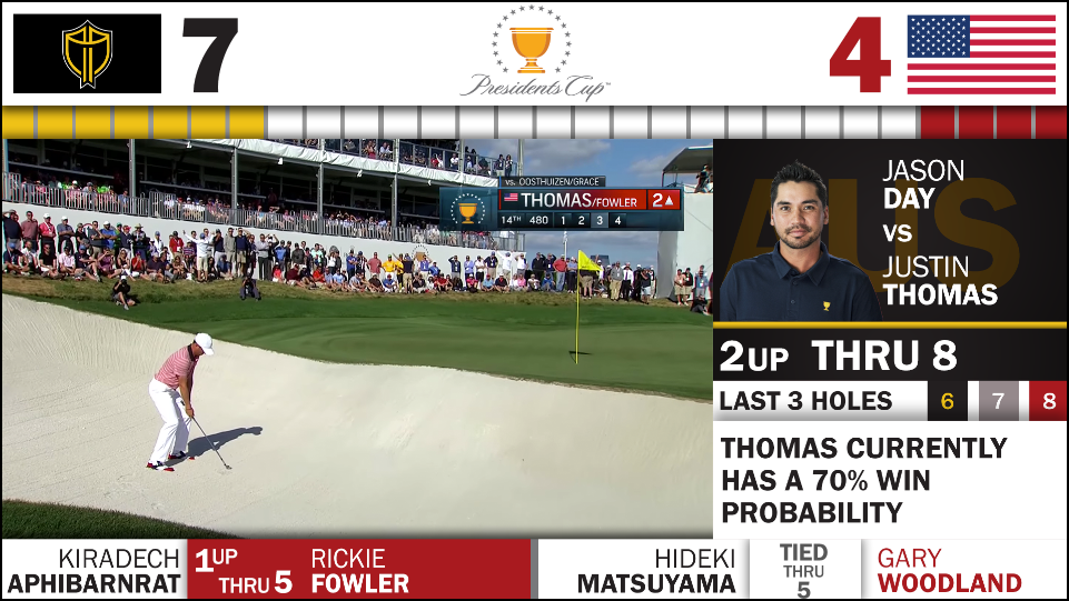
Singles matchup with a win probability graph.
Side slab displaying total score by hole of a singles match.
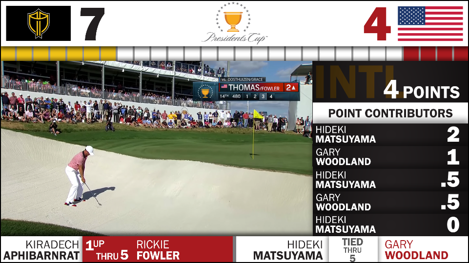
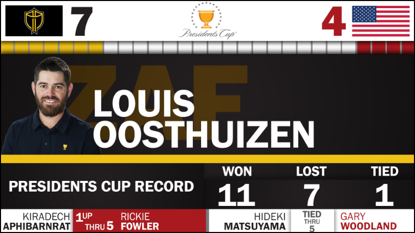
Side slab displaying a teams top point contributors.
Side slab displaying truncated match stats for a singles match.
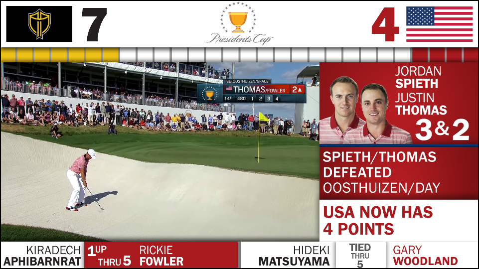
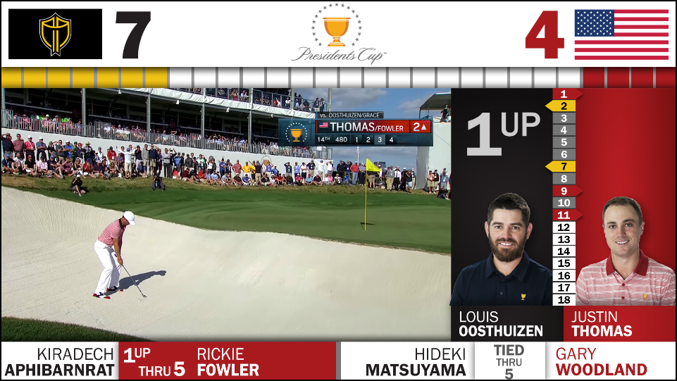
Side slab displaying the results of a doubles match.
While a majority of the project was built for LED boards situated around the course, some screens were formatted to be readable on a television, to be displayed throughout many of the fan engagement areas. Setting a universal aspect ratio kept development times down since we only had to deliver one product.
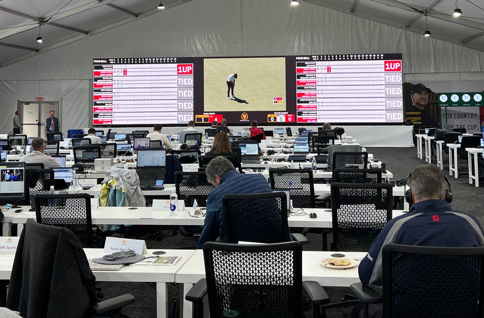
View of the media tent and a live view of all the matches.
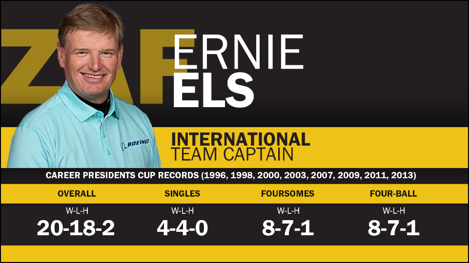
Team Captain takeover.
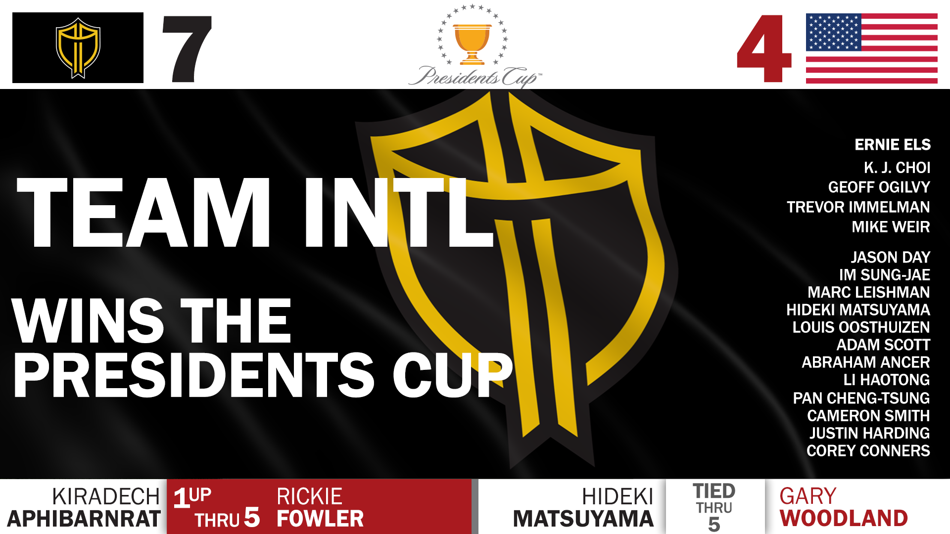
Test screen for a potential international win.
Fullscreen displaying a golfers past tournament stats.
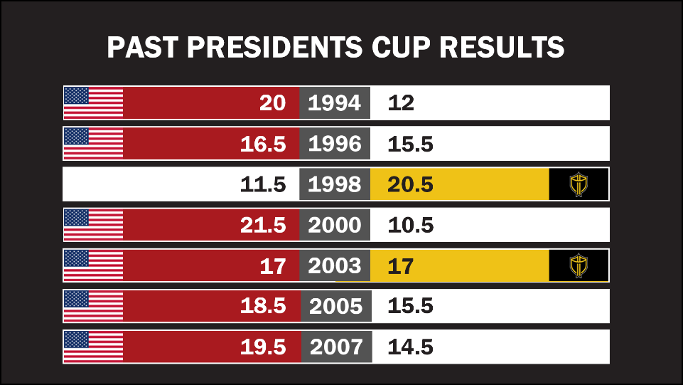
Takeover of the past tournament results.