WIMBLEDON
One of the most prestigious opportunities Ive ever had was working on the broadcast graphics for the 100th anniversary of Wimbledon’s own Centre Court. While many of the primary design systems were previously worked out and had been for years by a very talented member of my team, I was asked to add a few additional screens to the already existing package. These would range from simple Fullscreen and Lower Third stat lines to a new, creative way to display serve speeds, the speedometer graphic!

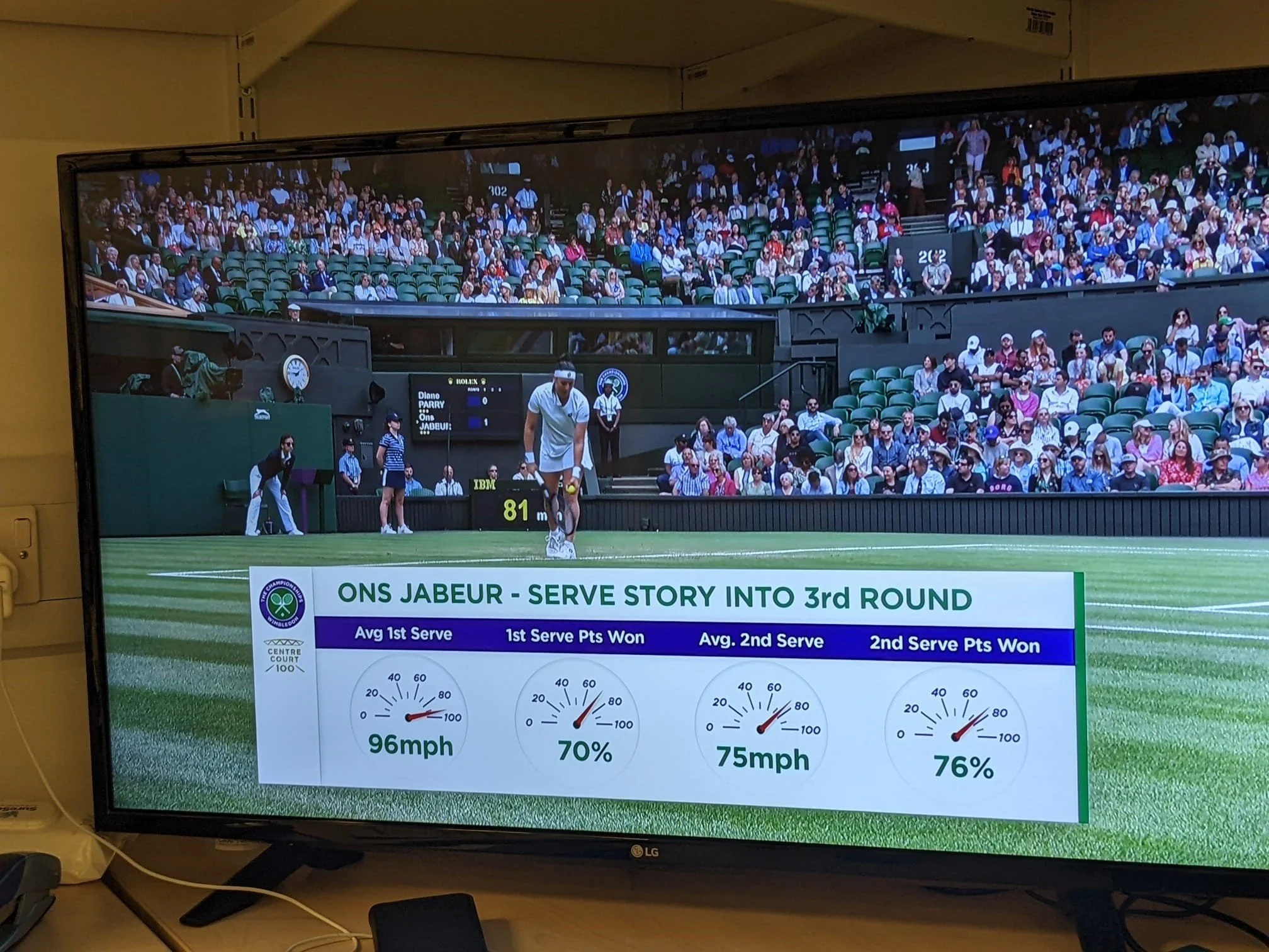
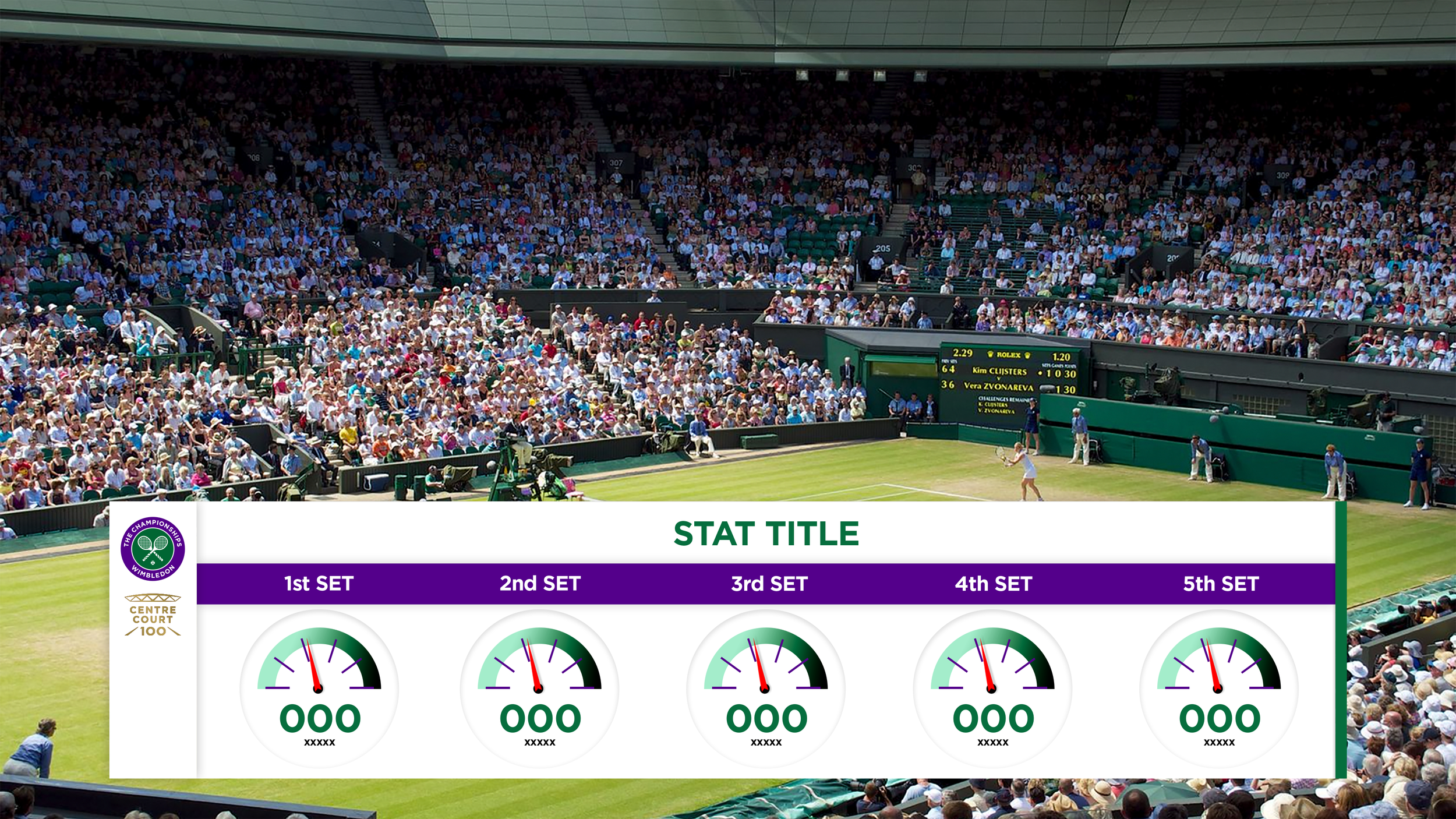
The Serve Speed graphic came about as an experiment to blur the lines of Wimbledons already clean, professional look with something edging towards fun and friendly. So, how do we show speed in a recognizable manner? A speedometer! With all the elements of the Wimbledon brand. The finished file had the dials sitting on a fixed pivot so on-site crew could set live data and push to broadcast in a matter of minutes. Manually inputted text was decided upon to allow for changes in metric systems or data types (speed or percentages; as shown to the right.) One to five dials could also be displayed at a time (typically the fastest serve from the last five sets would be shown.)
On-Air view of the Serve Speed screen.
Sample of the Serve Speed screen.
Sample of a text block side slab.
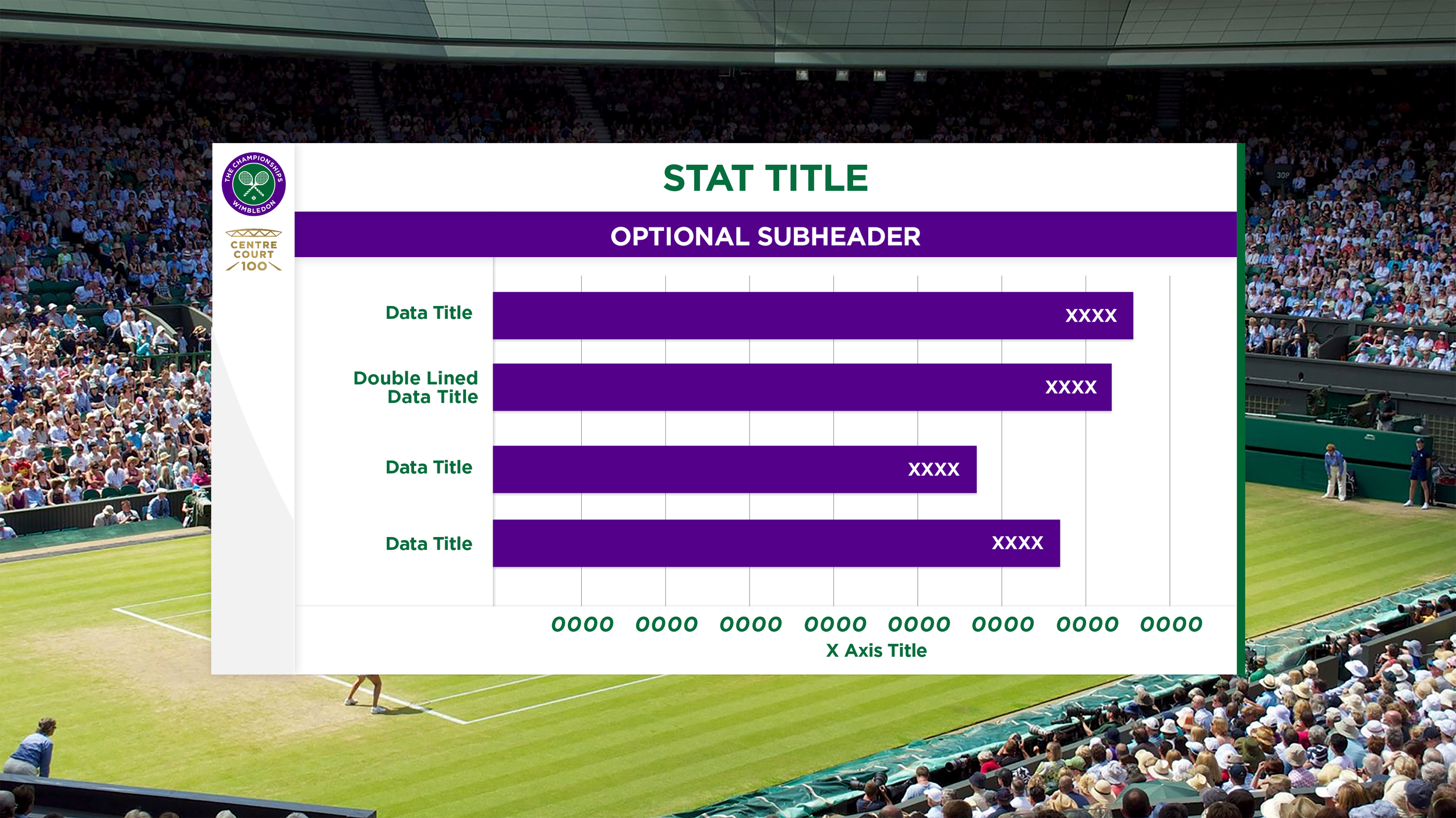
Sample of the Bar Chart screen.
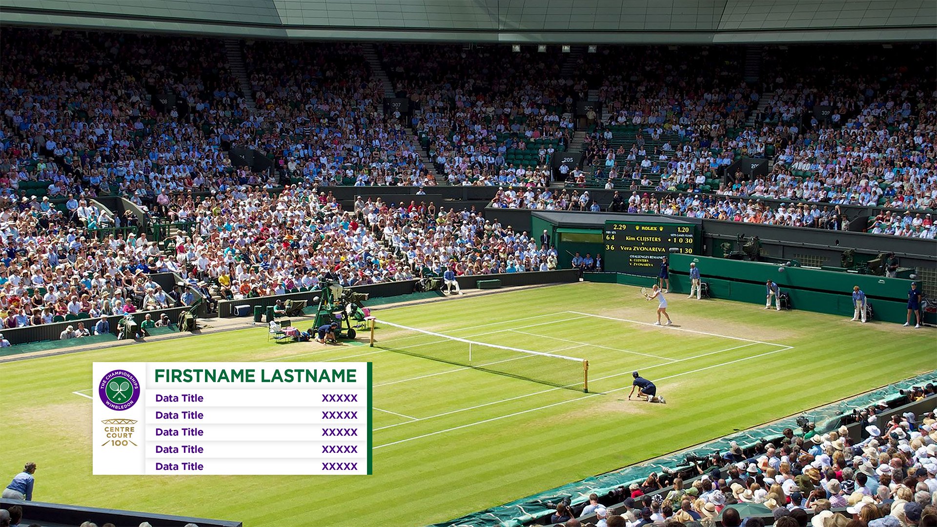
Sample of a 5 line player data set.
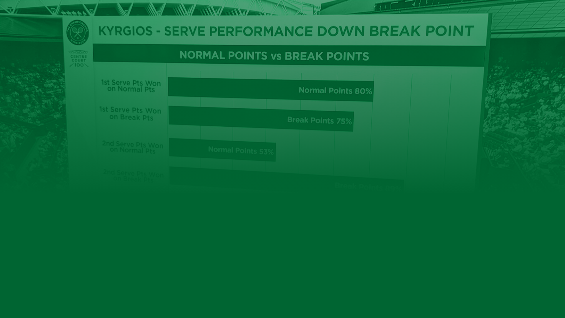
Other screens would transform more standard data into easy to comprehend layouts. Bar Charts and Comparison Lists would contrast Wimbledon’s purple against its clean white containers to draw the viewers eye.
Long meetings and lots of team collaboration would result in delivering a world-class product to rave client feedback.
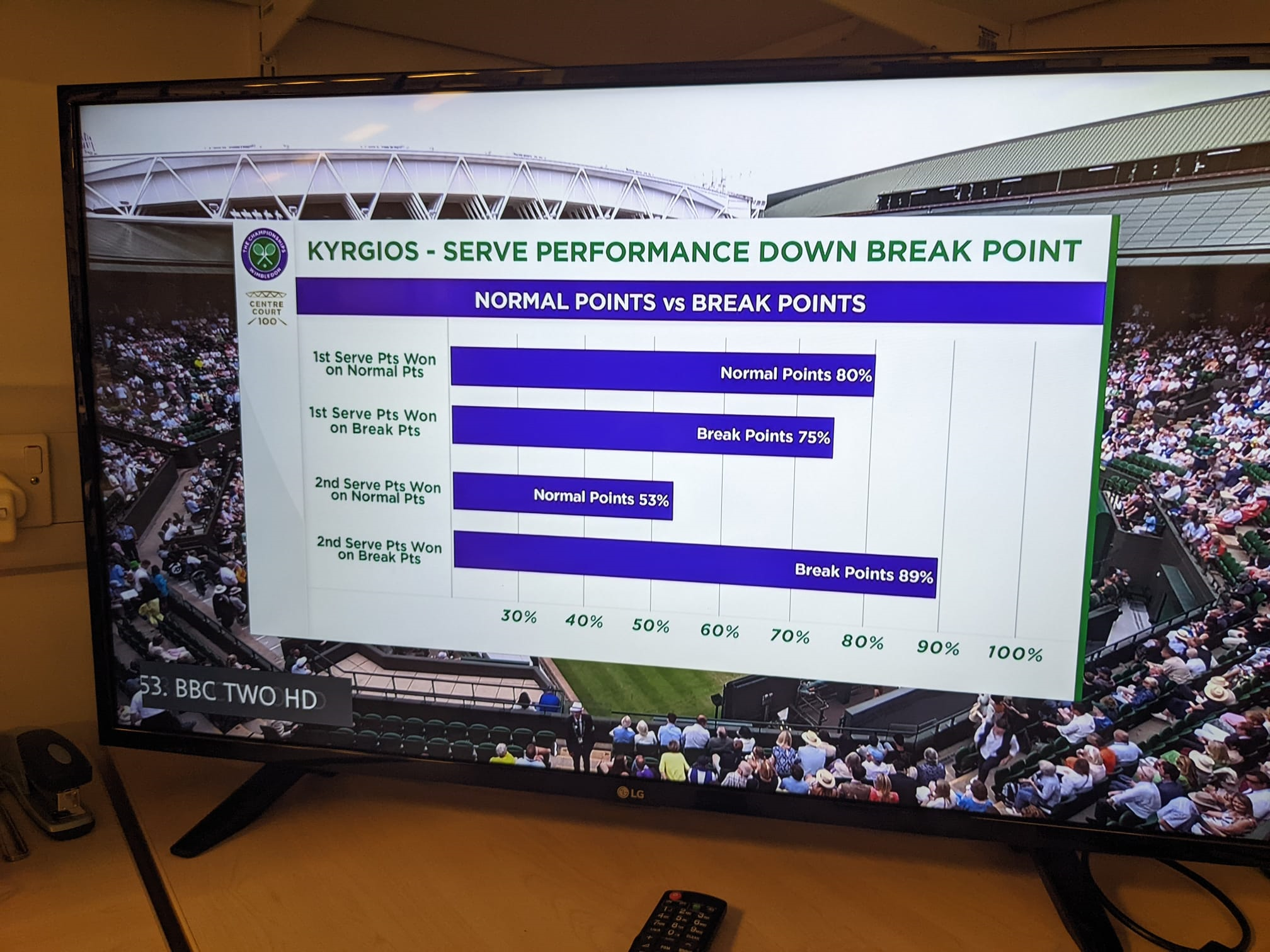
On-Air view of the Bar Chart screen.